Voicebox research and testing
The purpose of this project was to improve booking rates for Voicebox by way of research and testing, and integration of an improved email marketing strategy.
Approach
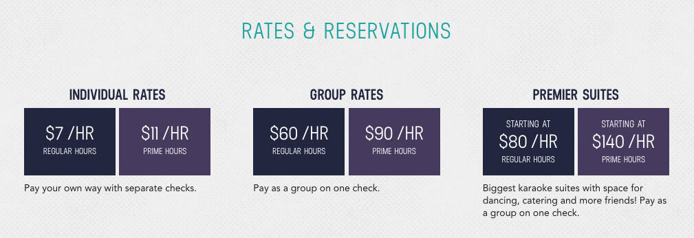
In reviewing analytic data and the email efforts to date, I wondered why were users were dropping off the rates page. Maybe there was work to be done on making the information more clear.

The original rates page, with 6 options for rates. This could be too much cognitive load.
A/B testing
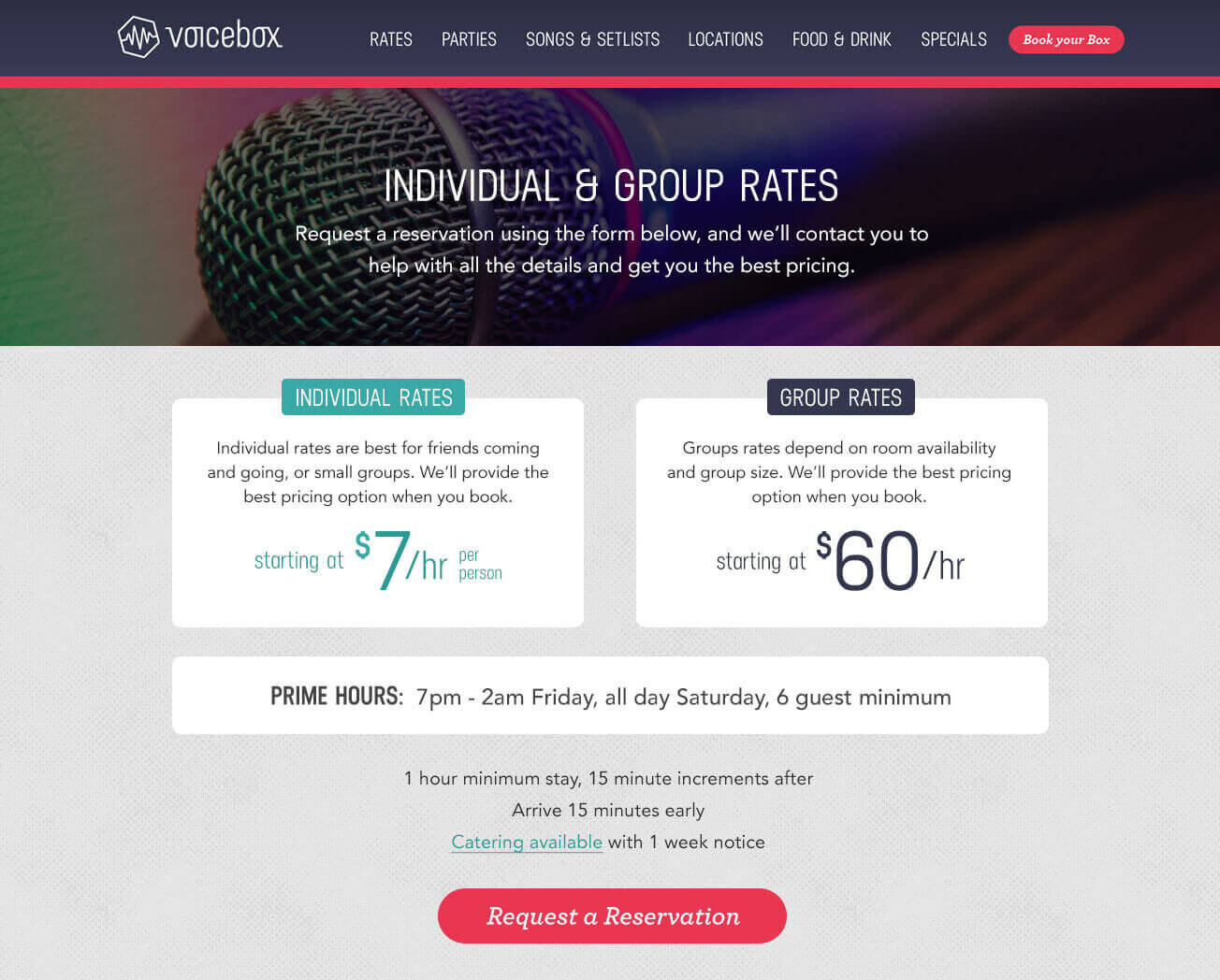
I designed a different arrangement of rate categories and rewrote the explanations in attempt to make the rates information more concise, intending to reduce cognitive load.

A proposed improvement to the rates area on the Voicebox website, featuring 2 options for rates, instead of 6. This new design won the A/B test.
Result of A/B test
The new design won. Users wanted more clarity around the choices, and reducing 6 choices down to 2 appeared to work well.
Content strategy
Another potential issue was at first less obvious to the user. The path to booking a karaoke room was cumbersome.
After clicking "book now" in an email, the user was first required to fill out a web form to request a reservation, and then wait for a callback from Voicebox to confirm the reservation. I strongly suggested implementing an online reservation system to make this process faster for their customers.
I also worked with the content strategist on providing more educational content in emails to build and foster a more long-lasting relationship with the customer. Historically, new Voicebox customers oftentimes became repeat customers.
Result of content strategy shift
This new content approach in emails resulted in a 50% increase in analytics goal completion within 2 months.

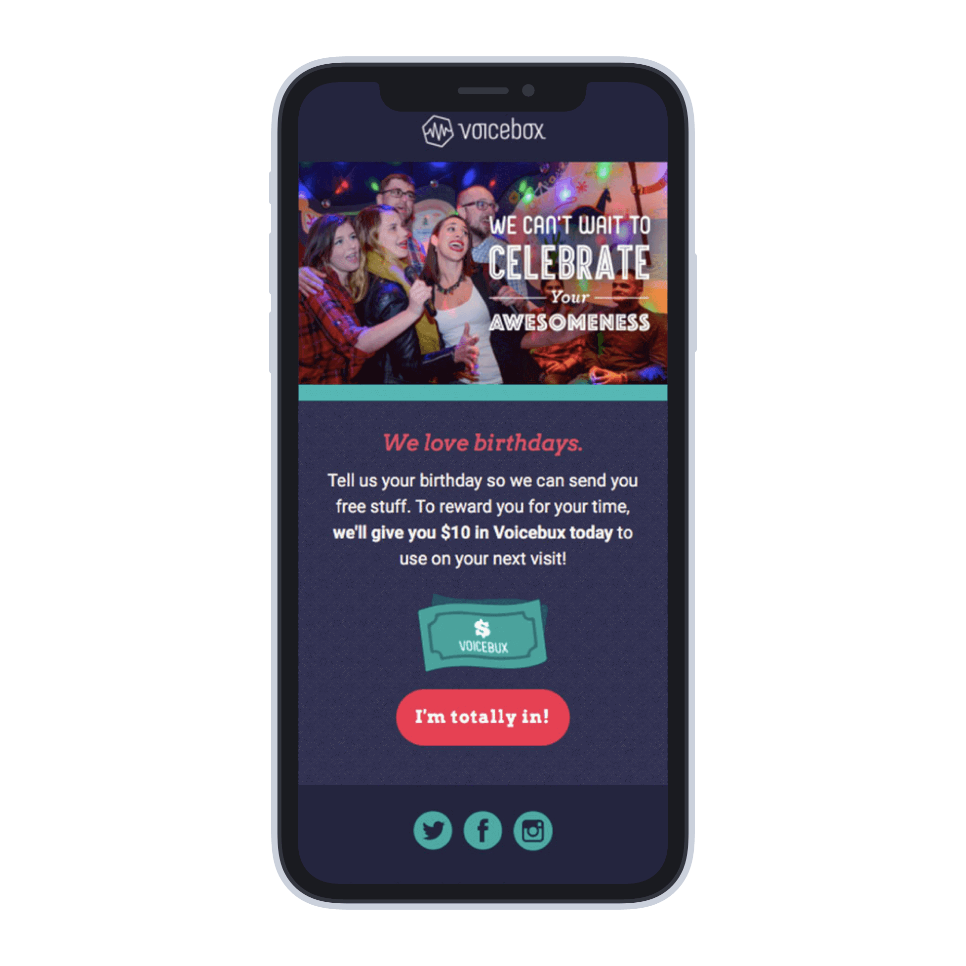
A mobile view of a Voicebox Karaoke email, featuring a new promotion for "Voicebux", which was offered when the customer shared their birthday with Voicebox.