U.S. Bank retail credit application
The purpose of this project is to modernize the credit card application experience used by U.S. Bank's retail partners. This responsive, white label web experience is consumed by over 2,000 brands, so consistency and customization are essential drivers of this design effort.
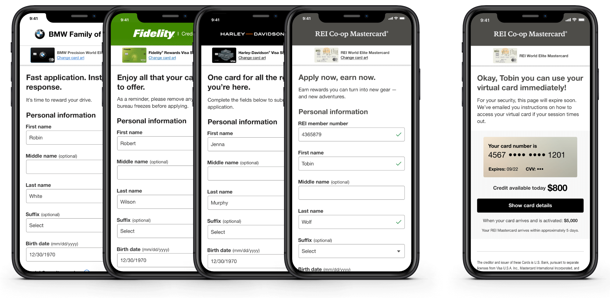
The partner digital acquisition platform, adapted to BMW, Fidelity, Harley-Davidson, and REI Co-op.
Project kickoff
There are several core goals of this design effort.
- Reduce the time a user spends acquiring a new instant line of credit.
- Make the experience accessible.
- Provide a modern, customizable platform for partners.
For perspective, the following image is the legacy application.
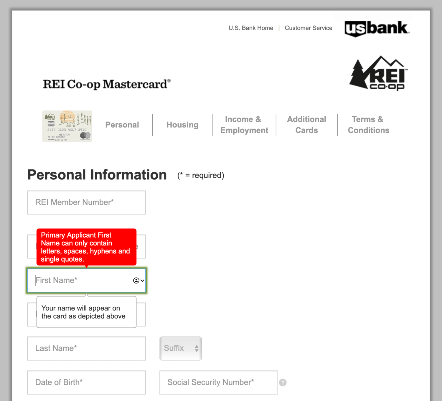
The legacy credit card application form for partners. There are noticable usability and accessibility issues, such as multiple tooltips layered on top of text inputs, error messages appearing in the wrong context, and placeholder text used as field labels.
To kickoff the project, a design sprint was held with stakeholders. I amalgamated the voted-for design ideas and created low-fidelity screens for a prototype we would test in a usability study. I collaborated with the customer experience and research teams to define the parameters for the test.
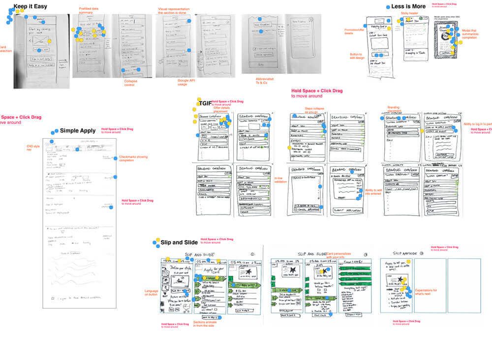
The InVision Freehand board used for the design sprint sketches, with roughly five stakeholder sketches of ideas.
Low-fidelity screens used in the test prototype, showing the selection of a card art option, the full credit card application, example accessibile error handling, and a modal with card reward details.
Wireframes
I studied hundreds of pages of business and validation rules on the legacy platform to understand the product, partner, and entry point variations. I also designed a logical framework of content mapping, working closely with the system architect.
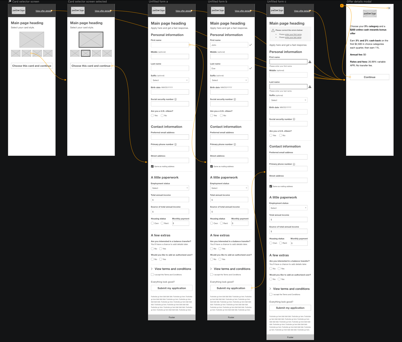
Since the project's inception, I have created and managed over 80 features' worth of wireframes, which include functional, interaction, and accessibility rules. I support four development teams, seeing the design through to production.
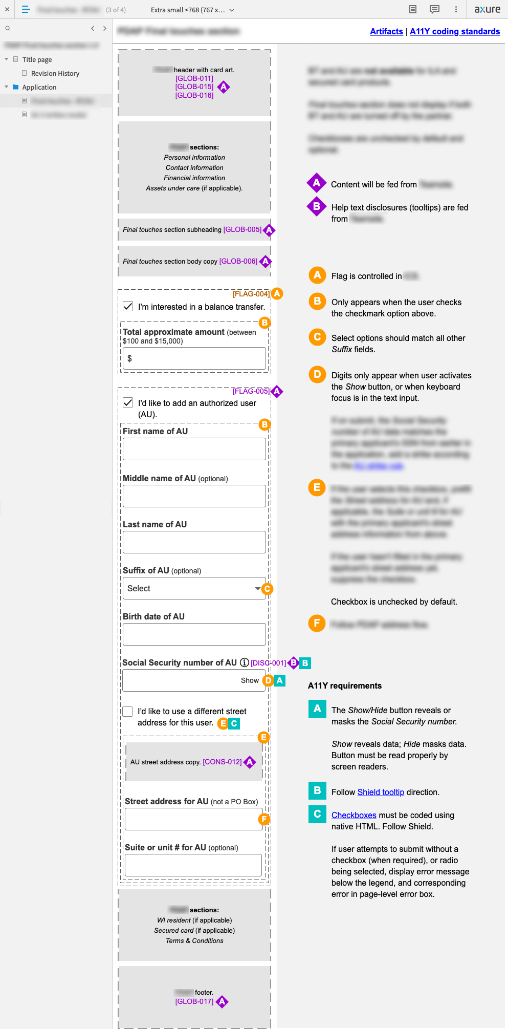
An Axure wireframe for a feature where the user may optionally add an authorized user and/or balance transfer before submitting the application.
Visual Design
For the UI, I started by assembling a set of patterns derived from the bank's design system. The challenge was to leverage this system yet also consider how well the components play with the variations of many different brands. The aim was to blend invisibly with the partner brands.
I surveyed some of our partners to understand what might work well for everyone.
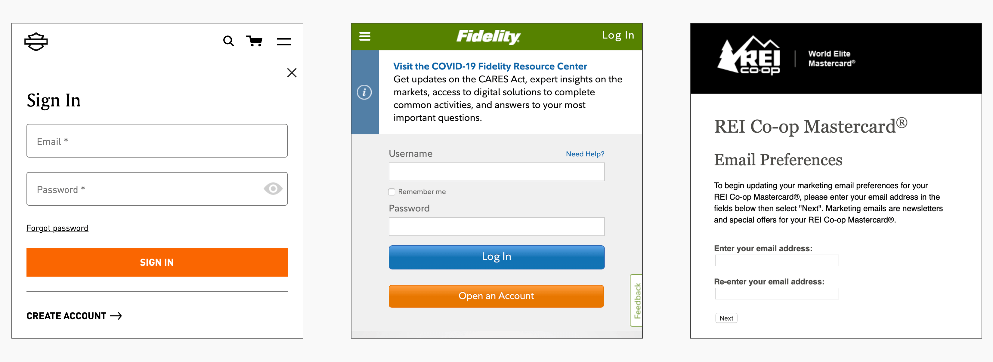
A selection of partner form styles. Harley-Davidson, Fidelity, and REI are three examples of partners that use a more traditional, default "boxy" feel for text inputs.
In addition to partner customization, I considered accessibility. The bank's design system's form elements contain floating labels, which have been debated in the accessibility space due to the movement of labels and smaller label text on focus.
Floating labels are also a pretty distinct style, and I sensed that the pattern might be too outside of the box for at least a subset of the partners. I proposed going with a more timeless box style for inputs and dropdowns, and stakeholders weighed in and agreed.
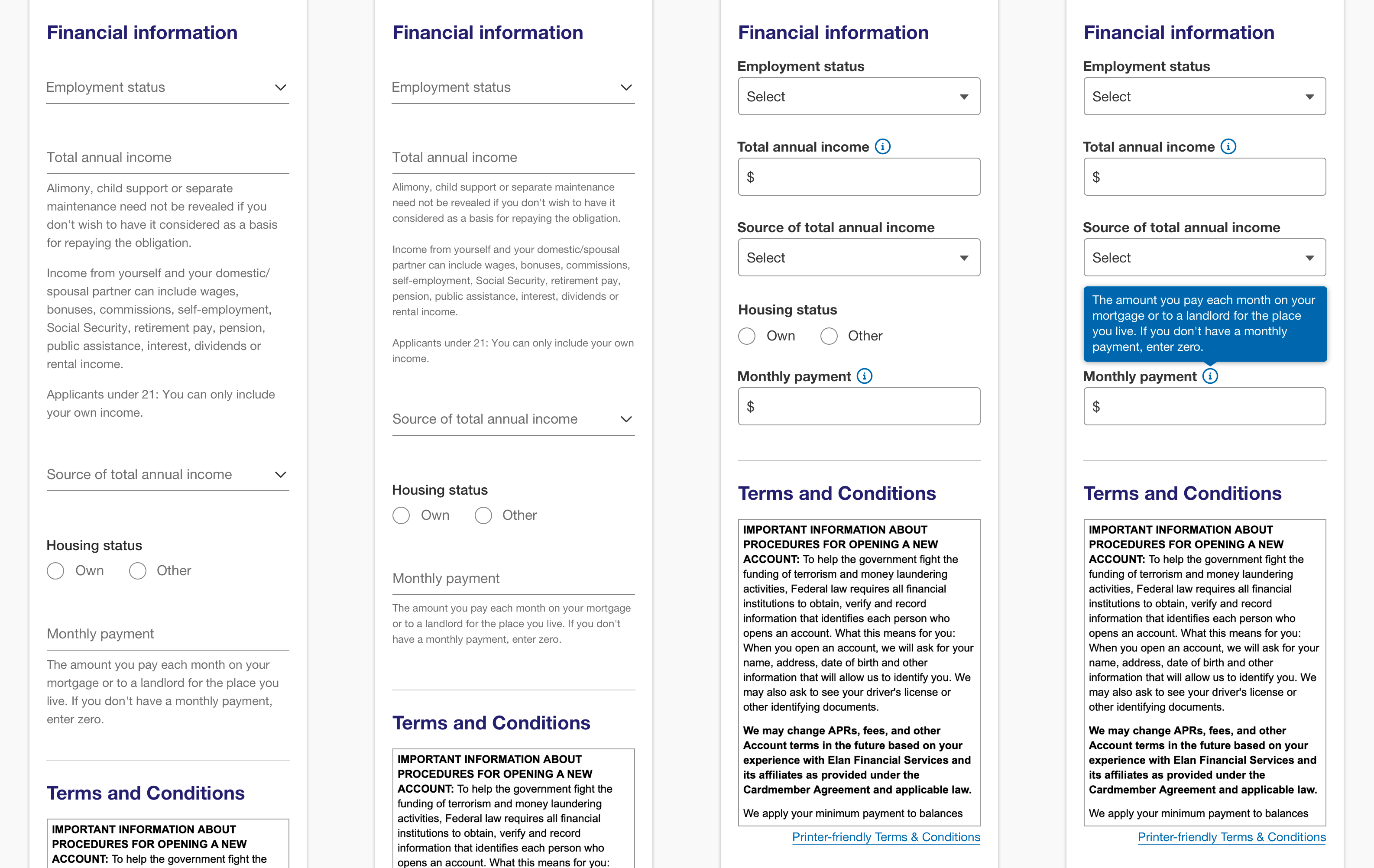
A Sketch brainstorming session: On the left I am playing with the unaltered U.S. Bank design system components for a section of the application, and on the right I'm showing the adaptation of text inputs and dropdowns to be more of a traditional look and behavior.
Prototyping
The instant credit line (to be used immediately in a retail location) makes up the MVP release. View the REI instant credit prototype in InVision .
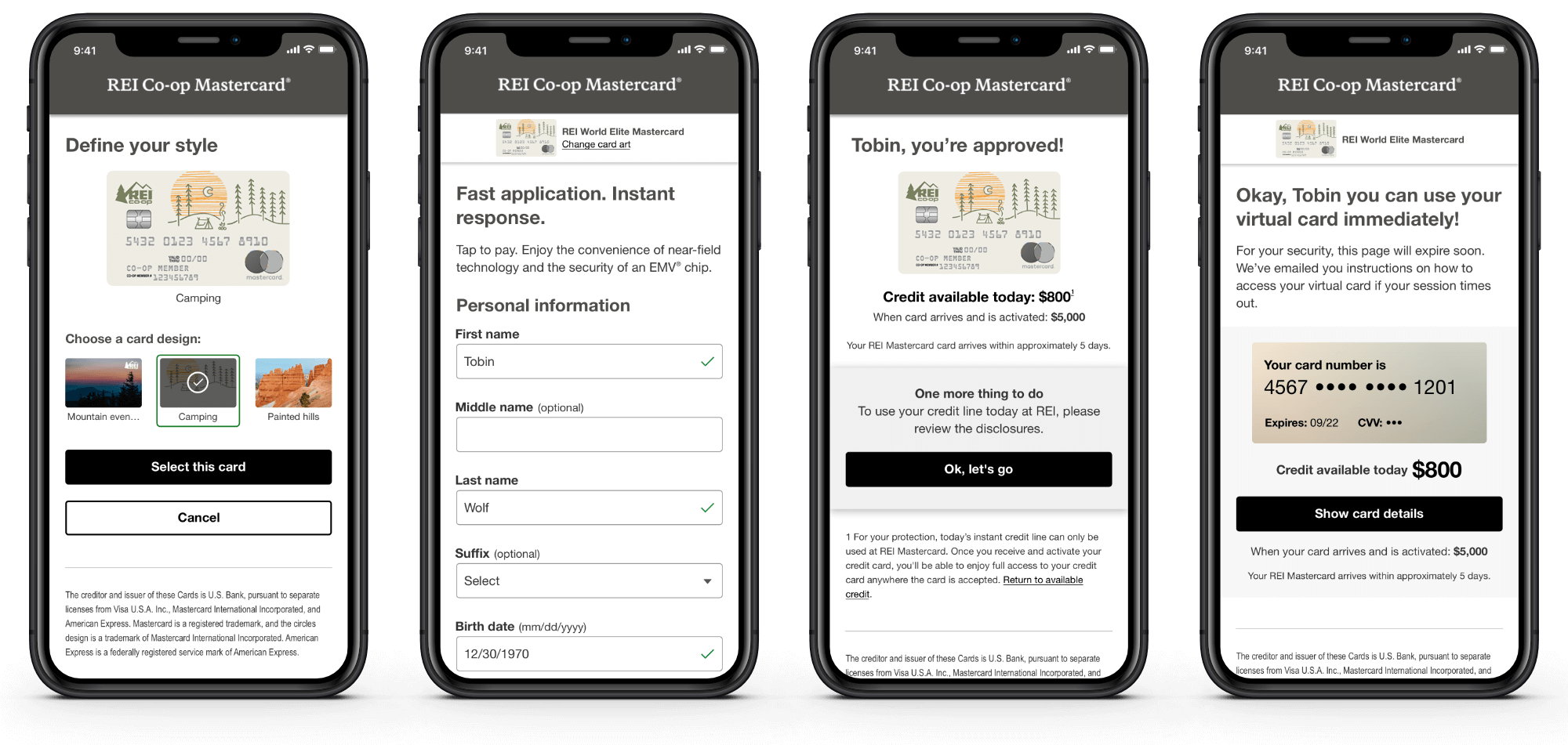
The REI instant line credit card application experience, including the card art selector, the application itself, an approval screen, and the REI virtual card.