Attis Trading website
The purpose of this project was to clarify the Attis brand, improve usability and provide a mobile-first experience.
To begin, I reviewed analytics which told me that users simply wanted contact information. I prioritized the Attis locations plus a client-requested feature of online ordering in the designs.
In order to add more clarity to their brand, I designed a tagline under the Attis Trading Co logo. It was evident in the drop-off rates that users may have not understood what this company was.
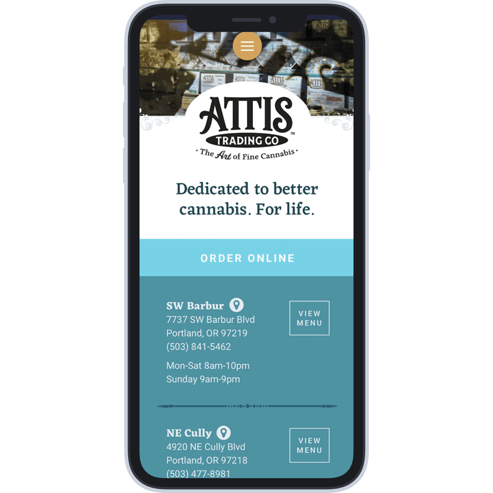
A mobile view of the Attis Trading locations page, featuring a cleaner brand and location information.
My process
I focused on getting users to the dispensary locations and positioning Attis as experts by leveraging their robust blog articles. Since their branding and color palettes were in transition, I took ideas from the interior of their dispensaries and used colors and textures that both complemented the brand and created a visual association for the user.
In Sketch I created a global artboard layout using guides that matched the Foundation 6 default columns so I could easily plan responsive blocks of content. I worked with the developer on handing off assets and CSS for his build.
Results
The data showed that the locator and order pages were generating more activity both on the website and to Attis’ Instagram feed.
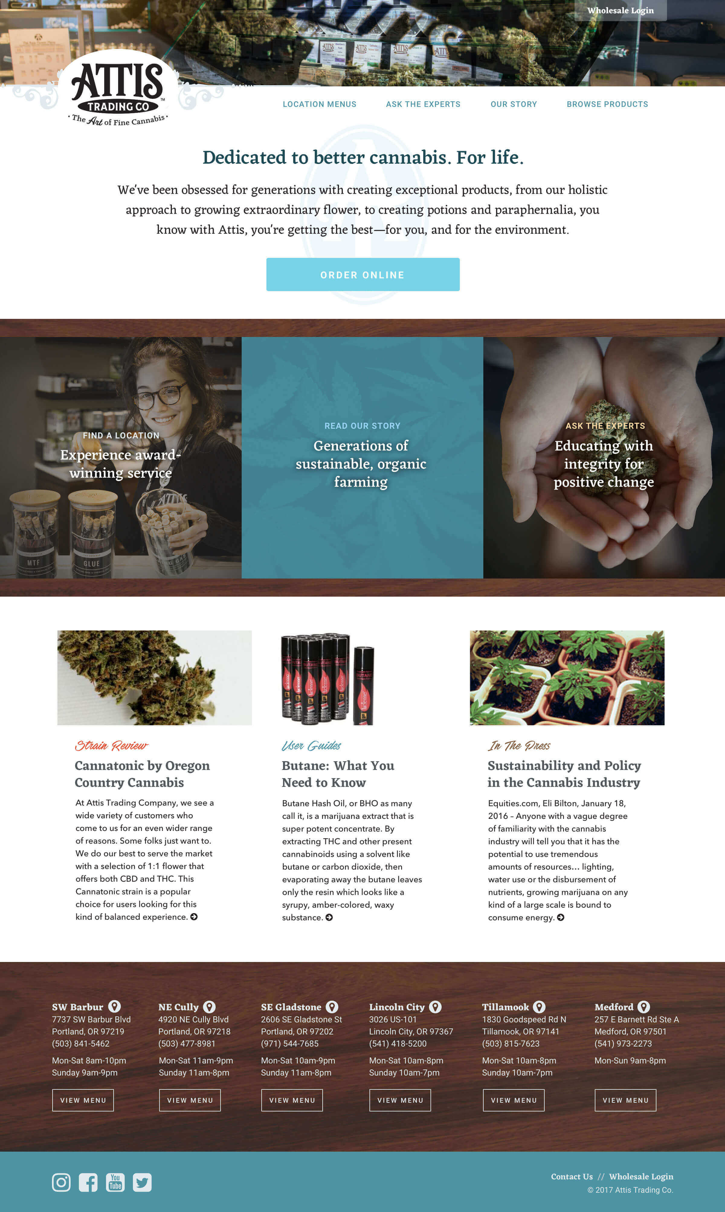
The desktop view of the Attis homepage, featuring styles from their physical locations and a clear brand identity.